Scott Thunelius, programmer and 3D artist known for his work on Subnautica, has shared with us the key principles behind creating retro-style graphics. As an example, he used Warpips, a tug-of-war strategy game he made with his friends in the spare time.

Scott Thunelius
What should developers keep in mind when creating graphics in the style of old games?
Less is more.
The most important thing about retro-style graphics is to leave a lot of the ideas from modern graphics aside and focus on what makes the art read and hit the thematic tones you’re trying to achieve. I would say this is most important in the model and texturing:
- The model should be as few polys as possible in order to create the silhouette and feel of the object, but no more than is needed;
- As for texturing, what is the lowest resolution possible to achieve the feel for the object.
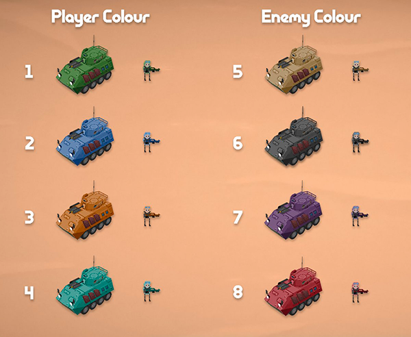
Warpips models
Try to make sure that the lighting and tones are readable from the distance your game takes place — it should play at the distance from the object to the camera and not try to go over the top with detail. There’s no point in rendering every rivet in a piece of metal when the tank takes up 120 pixels on the screen in the game view.
Who are Skirmish Mode Games?
- Skirmish Mode is a small indie team made up of four Unknown Worlds Entertainment developers, including level designer Kiel McDonald and artist Liam Tart.
- They all have full-time jobs at the studio behind Subnautica and Moonbreaker, but spend their spare time working on some side projects together.
- Warpips is one of them, which eventually turned into a standalone game published by Daedalic Entertainment.
- It is a tug-of-war strategy game that combines the feel of classic Comand & Conquer titles with the indirect control mechanics of the Nexus Wars map for StarCraft II.
What is the key difference between creating a retro-style 3D model and a model for games with modern graphics?
The main principles are the same: form, shape, tone, color, silhouette. But the transition from modern graphics to retro graphics lies in the workflow.
We won’t use modern tools like ZBrush or Substance. Old-fashioned polygon modeling in 3ds Max or Blender, unwrapped to be hand-painted directly in Photoshop. When your entire texture is 32×32, you can cover a lot of ground by just hand-painting the object.
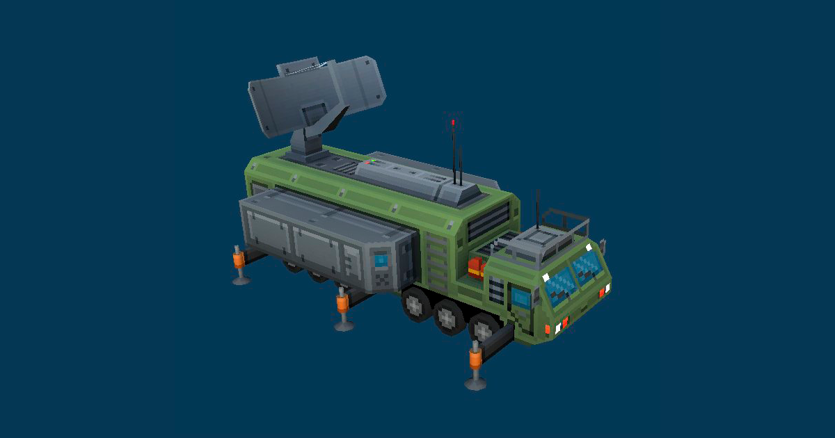
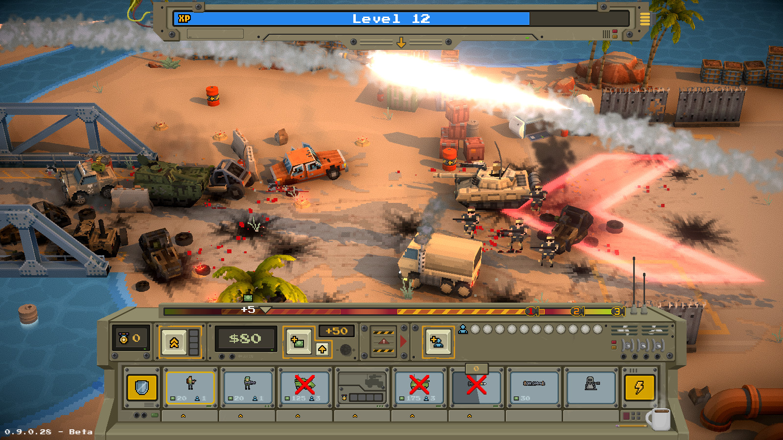
There’s no need for modern workflows that take advantage of PBR materials as most of the lighting on the object will be either unlit or, at best, use the old school Blinn Phong lighting model. While working on Warpips, we got a ton of mileage from just basic lighting and shadows, but also used modern post-processing effects like vignette, AO, and bloom.
These post-processing effects give that old school look a really modern feel. For me, they also do a good job of blurring the lines between the very flat-looking games of the early 2000s and modern games without losing that retro edge.
How was your modeling workflow organized?
For the vehicles in Warpips, we used a ton of reference photos but didn’t use any concept art. Modeling the vehicles directly from the references was more than enough. Because the game is highly stylized, there was no need to match the exact proportions of the vehicles.
We took on a very Advanced War style where we would smash the vehicles to look almost cartoonish.
Usually, we did this by blocking out the vehicle in a gray box form and then messing with the scaling tool to make the proportions look good for the game. After that, we would unwrap the object and match the texture to it.
The units were all hand-drawn frame by frame in Aesprite. Here is what the process looked like:
- I would first draw them as stick figures throughout the entire animation, getting the motion and movement looking good;
- Then I would make a single drawing to act as the “hero image”, from which I would build the rest of the animations;
- We would iterate on the design of the hero image until it read correctly from the distance of the game;
- Once we did that, I would animate the unit over the stick figure animations until we achieved the final result.
What were your inspirations for Warpips?
I personally love pixel art, and my favorite game of all time is Bungie’s Myth: The Fallen Lords. You can see a ton of the influence from that game in Warpips.
I loved the look of flat cards that represent 3D objects, so we often opted to use flat planes instead of 3D geometry to keep this style. Guard rails, bushes, and even crates on the ground would be flat billboards that always face the camera. That gave the game a ton of personality and kept that retro feel. To me that’s the sweet spot in game graphics — find the style that best fits the game’s theme and then iterate until you have the scene.
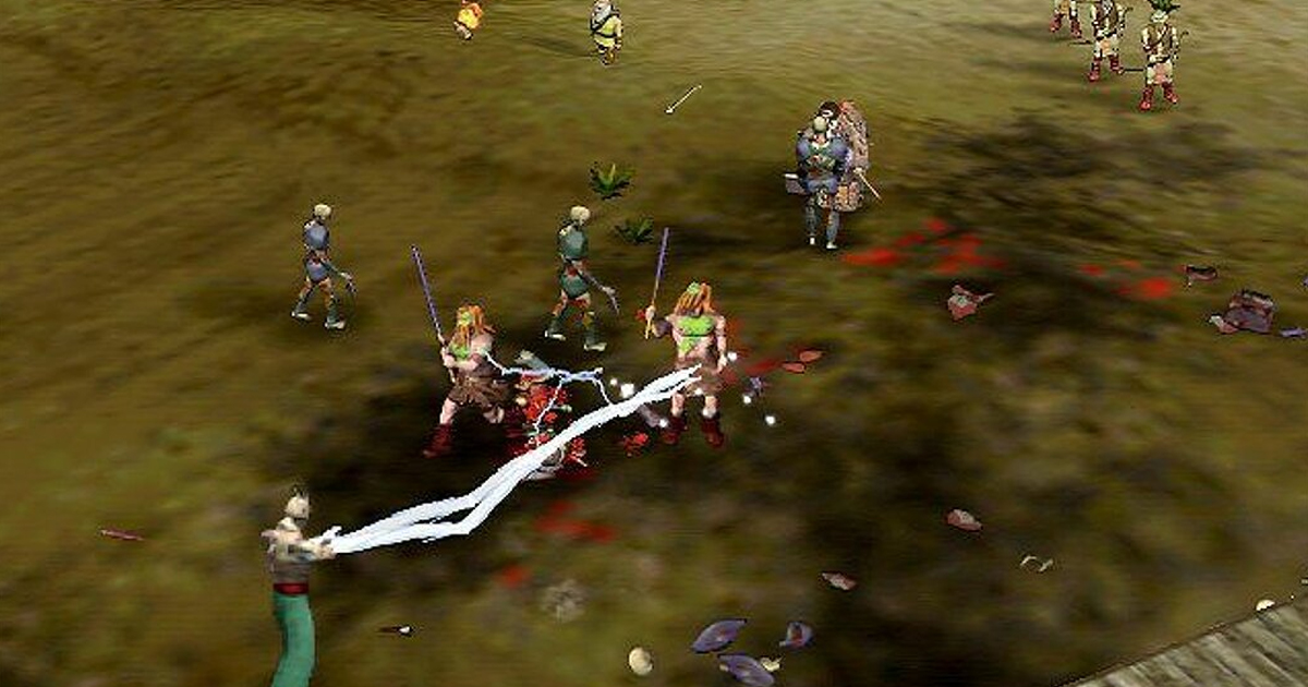
Myth: The Fallen Lords
Can you give some tips to other developers?
As a tiny team of four developers, we had to cut a ton of corners. The best tip I can give is that while the programmers build the game in gray boxes, let your artists develop the style of the game behind the scenes.
Then build out a couple core pieces of artwork. For Warpips, we made the Warpip unit (a little marine with an assault rifle) and the tank. That really helped us see the game as we wanted it, even with only a couple pieces of artwork.
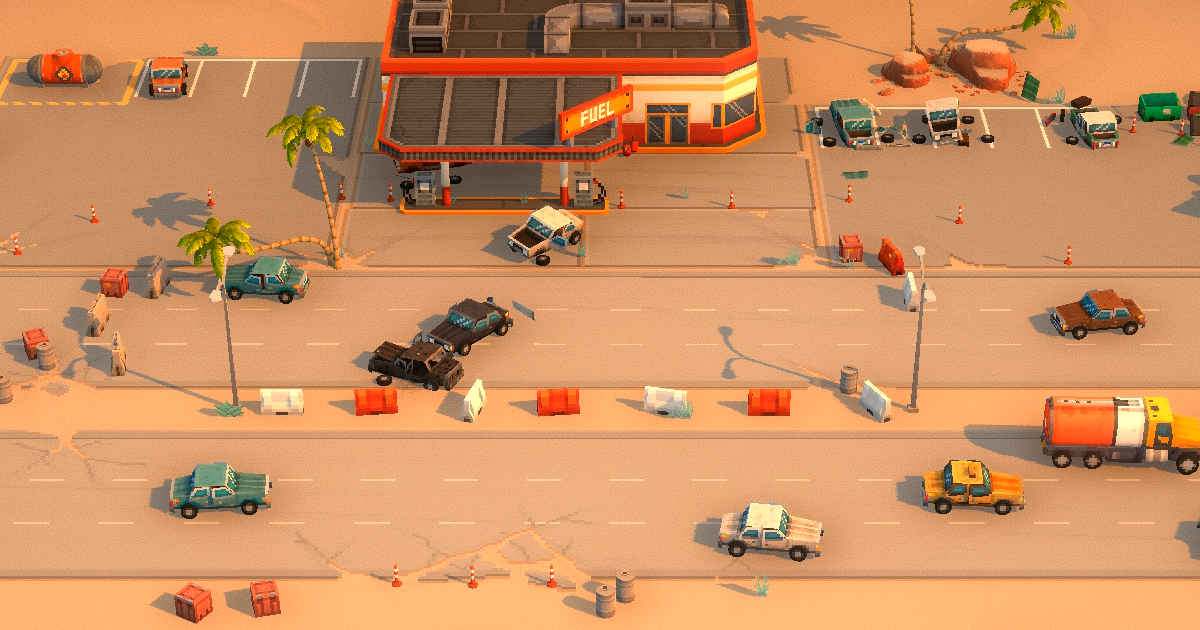
After that, we made a couple of test levels: some trees, some bushes, some crates, and parked cars. We used this to build one level and test it. We iterated again and again on these couple of units and this single level until we had the look we wanted. When we felt these were perfect, we moved on to building the rest of the levels and units.
This workflow may not work for all teams. But it was very helpful for us, as a very small indie team building this game in our spare time, to break the tasks into smaller pieces. This allowed us to formulate the game’s look early.
