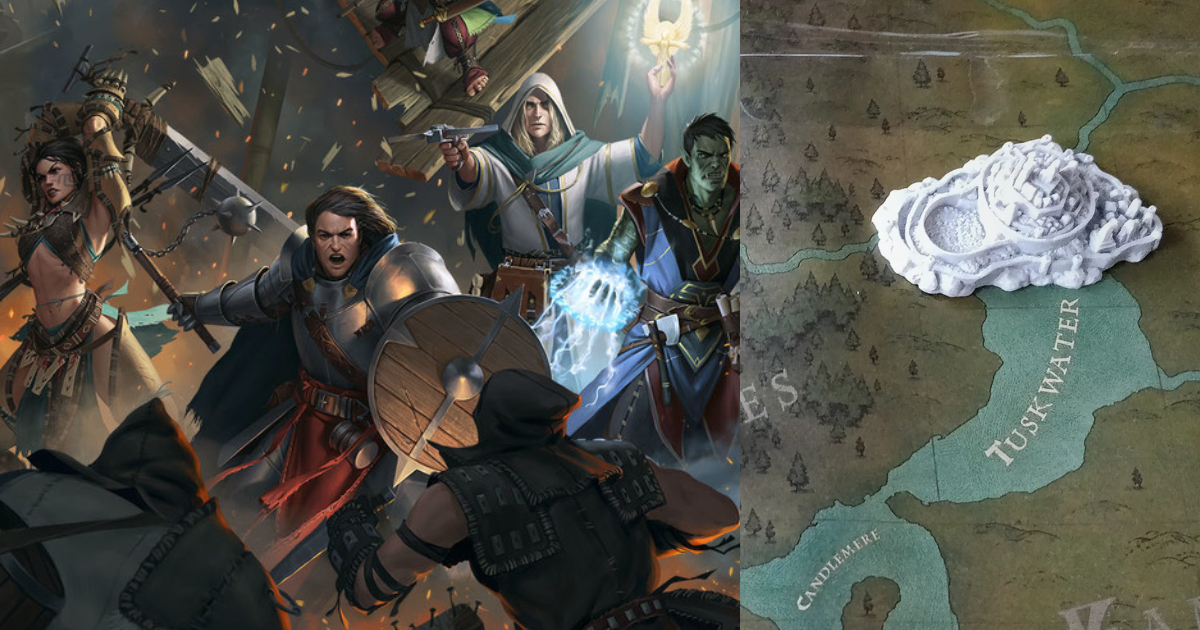
To celebrate its 8th anniversary, Owlcat Games looks back at the development of its very first game. Here is a breakdown of creating the Kingdom management system for Pathfinder: Kingmaker.

Owlcat Games wanted to add a settlement management mechanic to Pathfinder: Kingmaker, but didn’t have an understanding of implementing this concept and how to make it clear to players while staying true to the original.
“We were very passionate about the tabletop version and wanted to bring Pathfinder to life in the PC version, recreating as much as possible all the aspects of the game that resonated with fans around the world,” the studio wrote in a post on Reddit.
The task was assigned to Mikhail Rotfort, currently the lead UI engineer at Owclat, who recalled the process of creating the Kingdom management UI for the game.
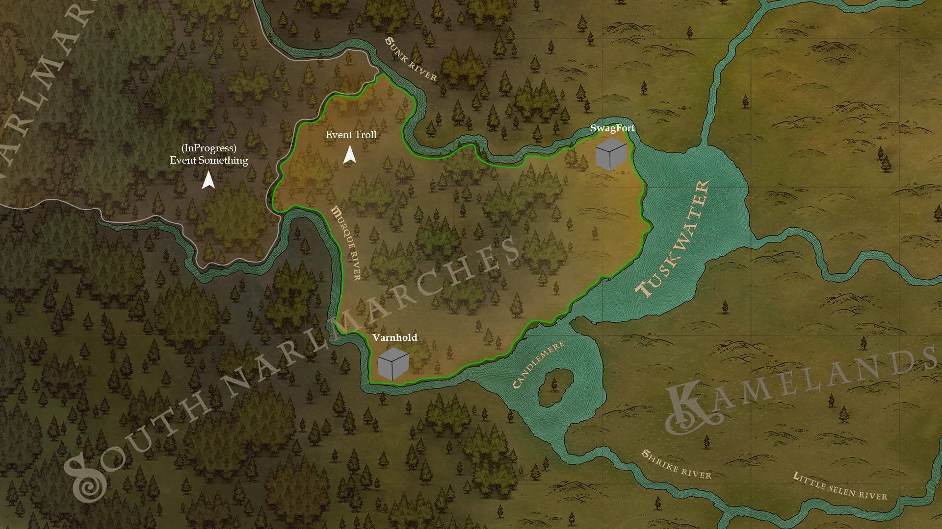
He first created a map with a simple interface to cover all the possible mechanics and test their basic functionality. “I had originally planned to use a region map, but there was a question of how best to place the event and task cards,” he said.
Rotfort showed the first draft to creative director Alexander Mishulin, who criticized this version, with the team calling it “boring, faded, and incomprehensible.” Although he eventually realized that his colleagues were right, at the time “it seemed to me that my work was being devalued and I took great offense.”

One of the first drafts of the settlement system for Pathfinder: Kingmaker
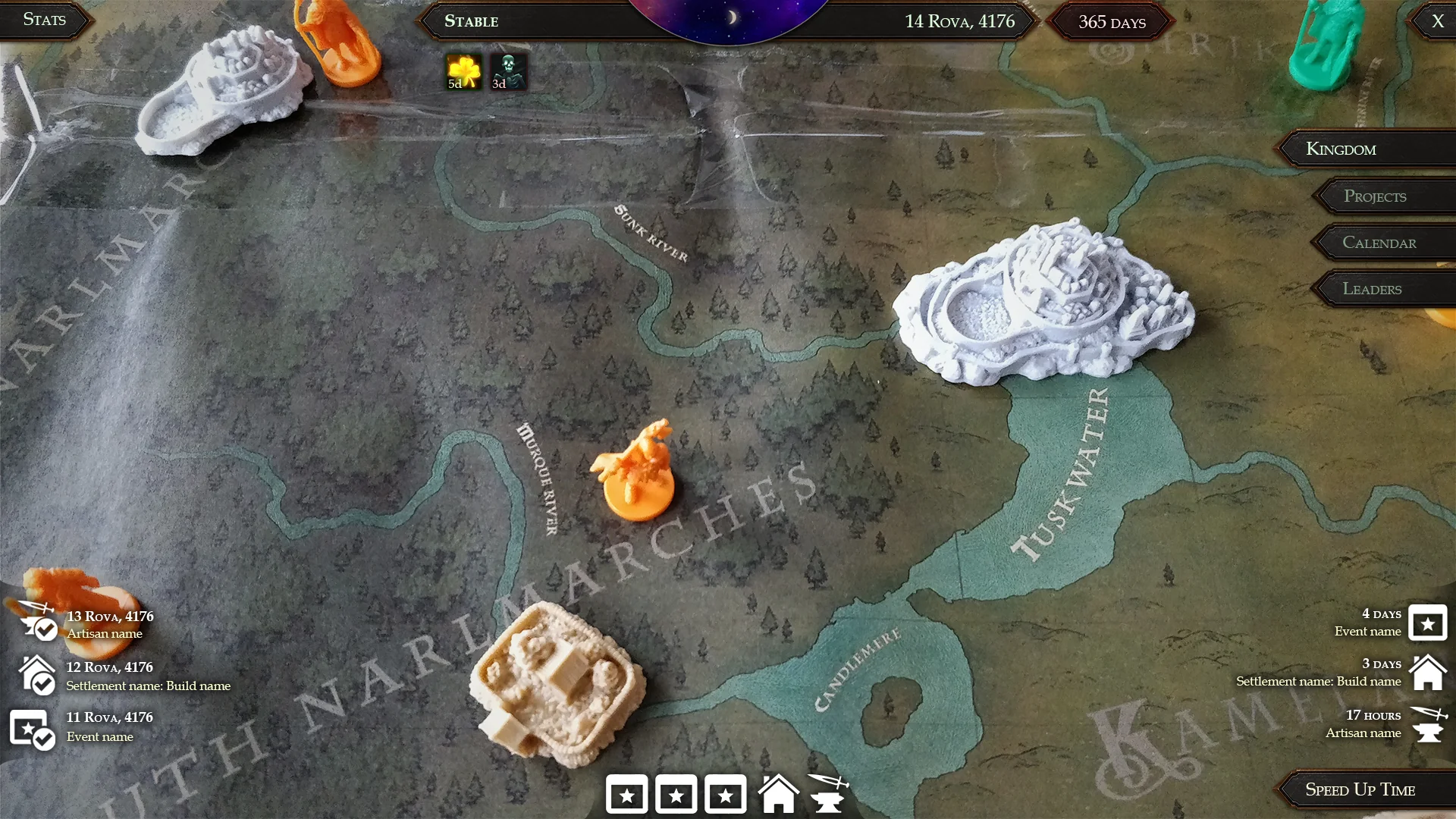
With the second version, Rotfort took a more creative approach. He printed out the global map on A4 sheets, glued them together, and used city figures from the Inis board game as settlements. “I photographed the result from all sides and transferred it to my computer to further refine the interface design,” the designer recalled. “The figures from the board game added volume to the kingdom and helped shape the future visuals.”
He then created a concept for the event cards, also printing out characters and putting them on stands to visualize the advisor selection interface.

The second version of the Kingdom map with Inis figures
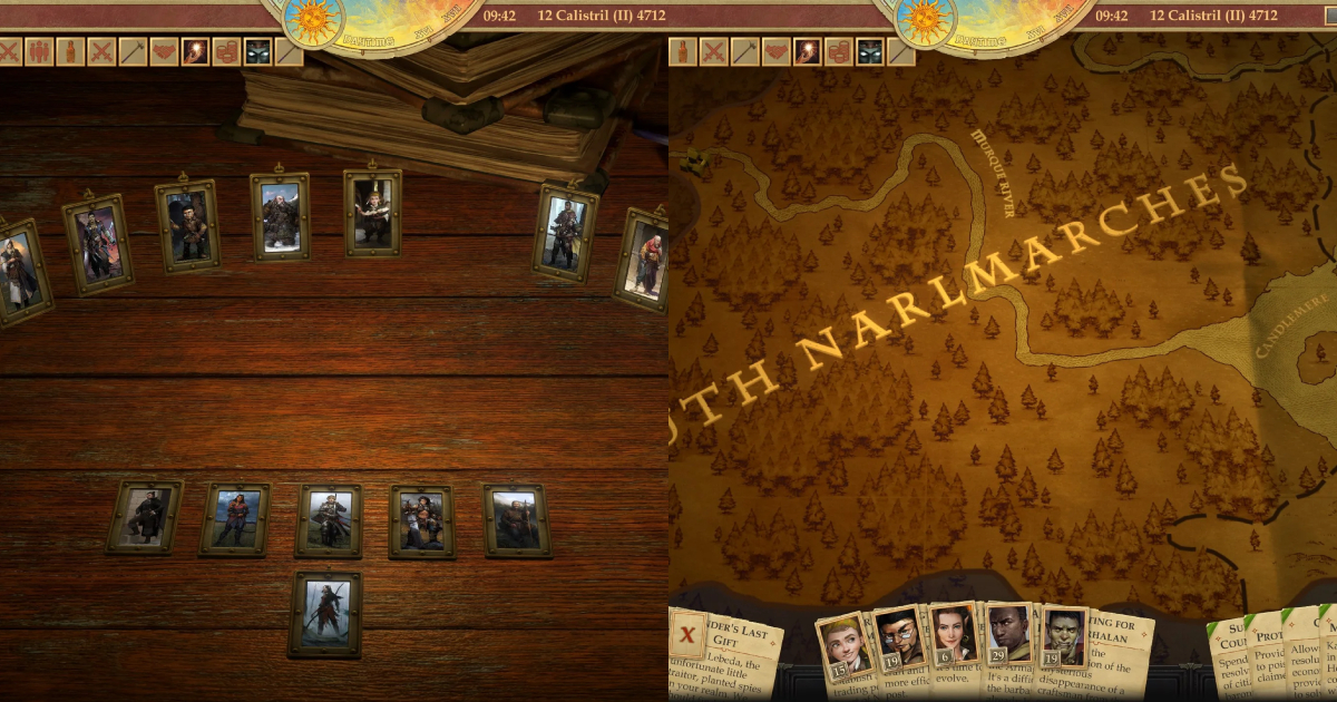
According to Rotfort, this version was approved with almost no edits: “The new design turned out to be user-friendly, clear and authentic. After discussing all the details, most of the ideas went into development.”
In its post, Owlcat acknowledged that not all players loved the Kingdom management system, but it still gained many fans in the community. The studio also thanked Rotfort for using such a creative approach to this task and using every resource possible to create the final design.

The final version of the Kingdom management design and UI
Launched in September 2018, Pathfinder: Kingmaker received generally positive reviews from critics and players. The game sold over 1 million units globally and was followed by the even more successful sequel — Wrath of the Righteous.
Last year, Owlcat Games released its third title, Warhammer 40,000: Rogue Trader, which surpassed 500k copies sold in its first month.
For more details about designing the Kingdom management UI, check out the studio’s full post.
