When people ask me about the secret of designing mobile games, I always say one thing – forget everything you knew before mobile games. All of your old experience is irrelevant here.
Once you place everything a player will theoretically need in a window – primary information, secondary info, fancy heading, some monograms and art objects – and you will realize that you ran out of your mobile screen right at stage one. So here’s Rule #1:
1. Keep it simple
Your main goal is to place information on this screen the most simple, clear and convenient way.
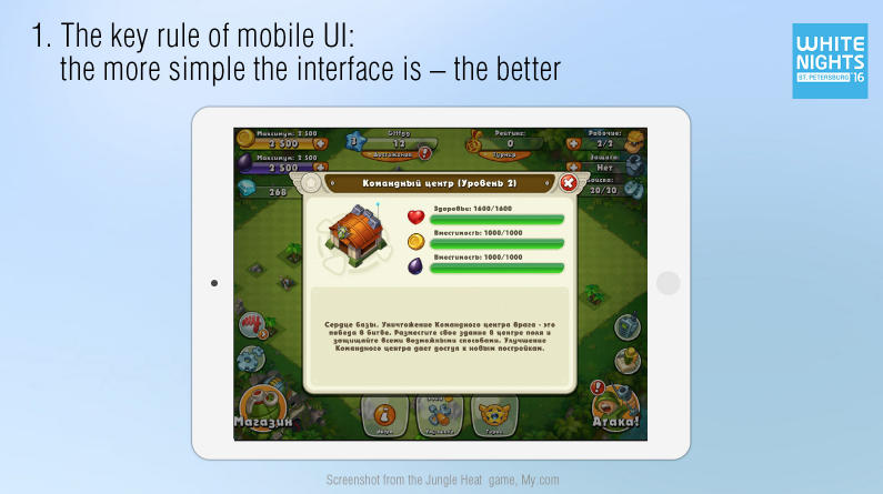
Besides, small and detailed pictures do not work here at all. You cannot simply take an image from a big browser game, squeeze it and place into a mobile device.
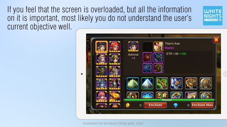
I often hear: “In order to solve this task completely, I need all these information, all these actions, so, please, cram them into a single window”.
But no way! If it happens, you are likely far away from understanding the key task of the user, and then wrongfully divide it in into subtasks. And the user will be forced to make all of these actions in his mind while working with your interface, and, believe me, he will. This is how the user’s brain works and it has been checked and proven many times. That leads us to Rule #2:
2. Prioritize the tasks
On the slide below you can see a screenshot from Heroes Charge. Presumably, here the player selects a character to get it ‘pumped up’ with artifacts and resources.
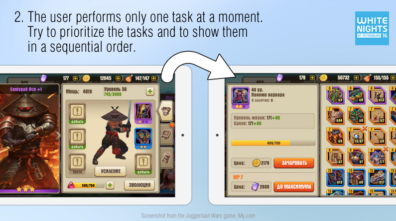
And down below we have a slide with functionally similar window from Juggernaut Wars. In this window, the player has already selected a character, researched his artifacts and made a decision on what to do next. And only after this his attention is focused on one and only task – pumping up the artifacts. He is offered a super convenient interface for solving this task.
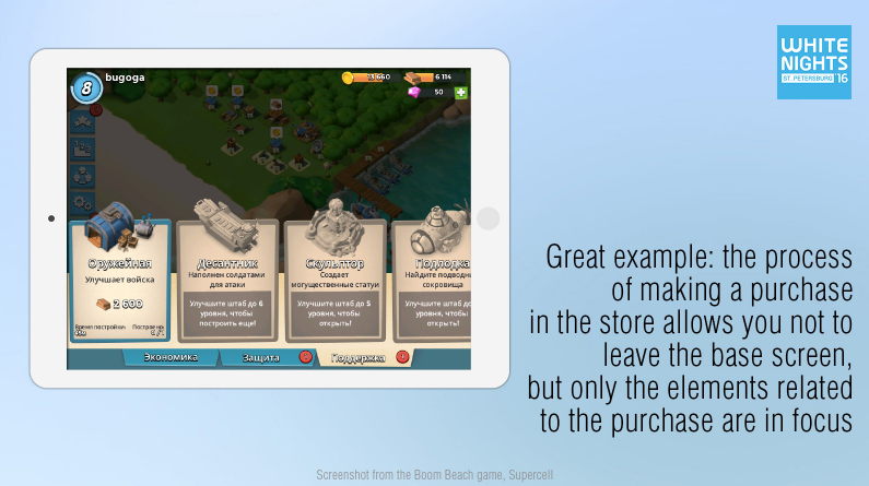
Another great example – Boom Beach. Although the user continues to see his base while buying things in the store, his attention is focused only on the process of purchasing, and everything else is in the background.
3. Organize the information
When your game starts showing some kind of informational architecture, and you have split the key functions into specific steps, pay your maximum attention to each individual window. It is important not only to serve the information but also to work on its perception. Break up the content into logical units, sharing a single task.
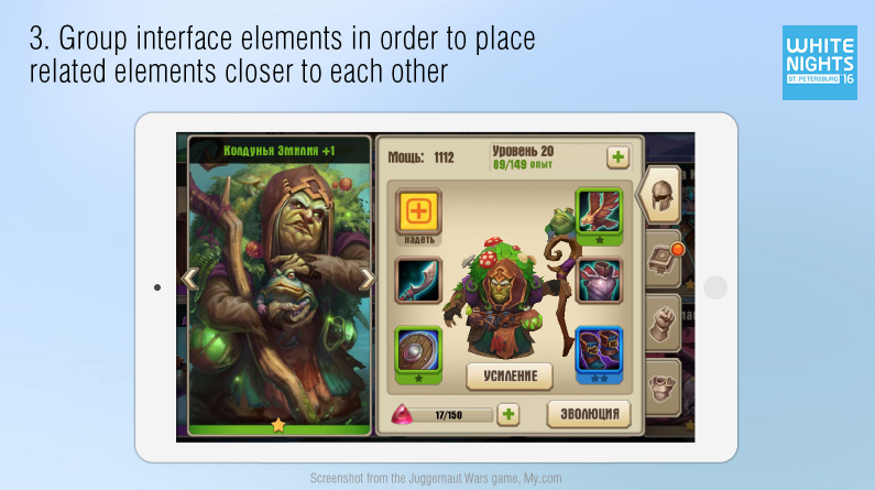
For instance, in Juggernaut Wars it is clearly shown that you can increase the level by pushing “+”. It’s also clear that the collection of artifacts is directly related to “adding power”, and the progress bar at the very bottom has some obvious effect on evolution. When all of this is done, it seems that everything is logical and obvious. But there is a range of examples when related interface elements are scattered all around the window and are placed in completely inconvenient locations.
If you conduct all of this work during the design stage, the player will not have to think extra about the laws of your gaming world. The gaming process will not have obstacles, which will make him worry.
These are exactly the “little” things that make up for the quality of the end product and the answer to the question if your user is loyal or not. Even if the user fails to answer this question directly.
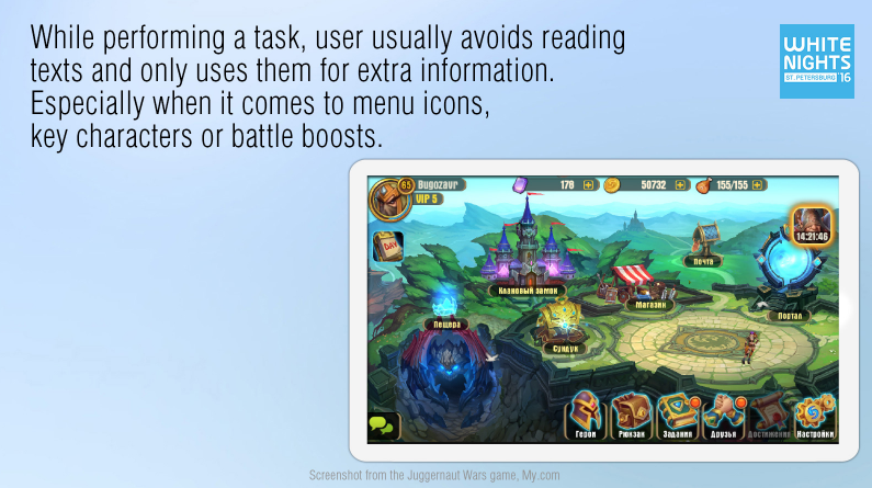
Looking ahead, I want to dispel the myth about the text. I often hear from the developers: “I took a risk to create a complex window, but here I have some rules that should make everything clear.” The user does not care about the rules – he does not really want to read at all, he came to you to have fun. So, do not try to solve all your problems through textual explanations.
4. Use simple forms to guide a player
Context pop-ups are good but a player only uses them as additional information. At least, in such games where the game’s plot is not a part of the core gameplay. So, while working on the interface, do not forget about images, which help a player to easily identify and remember your objects.
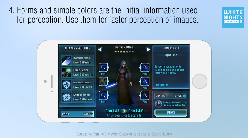
Generally, the primary information, which can be easily perceived are shapes and colors – red, blue, yellow and green. That’s why, if you want the elements to be easily found, processed and remembered, make them different. A good menu is the one featuring, for instance, a brown backpack, a green book, and a yellow gear – a range of different and recognizable objects.
In Star Wars: Galaxy of Heroes almost all the interface elements are of the same color. Everything is blue there – from menu bars and fonts to icons of items and abilities and key buttons. This somewhat hinders the information processing.
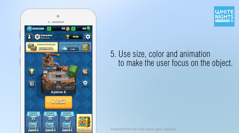
5. Size, color, and animation of object are also very useful
The size, color, and animation of objects are important not only for fast search and perception of information but also for setting priorities inside your window. It’s obvious that a bright and flickering button is something important, making you focus and leading to some action. But do not overuse it: leading a player to a button that is not topical or not available at the moment is a huge mistake. Let the elements light up consequently taking the player through your games in an orderly fashion. This may significantly simplify the game routines for the user.
6. You don’t need the whole screen
A widely spread mistake of game developers is the maximum use of the device’s screen. On one hand, it is good. But on the other, when we are talking about multiple small objects that superimpose one another and fill up all the screen area, the screen turns into a motley grid and your eyes start scanning the screen for a needed object.
BTW, check out the screenshot below.
The most frequently used elements on the screen are moved to the right. You should not forget about it because otherwise the right-handed users (and they are the majority) will have to reach out to the left side of the screen and then move the hand to see what changed on the right, then reach out again and so on. It’s weird, but even some popular developers forget about it.
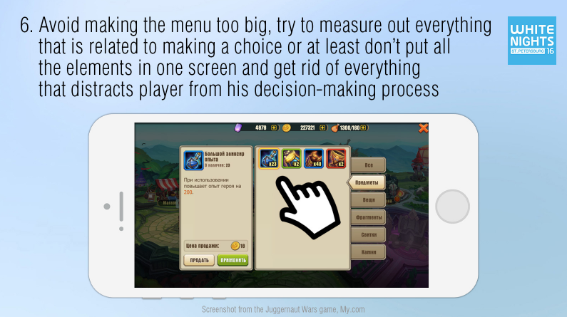
According to Hick’s law (William Edmund Hick (1912-1975) – British psychologist who worked at Cambridge University on the problems of experimental psychology), the more elements in the list, the more time a person will need to make a choice. The more buttons you place on a menu, the more complex you make it for the user. The more information you have on one screen, the more time it will take to process it.

On the screen to the right, you see a list that does not appear huge but each item has one subitem. A player will spend a lot of time trying to analyze all this information, however, this could be easily avoided.
7. Decrease the number of choices
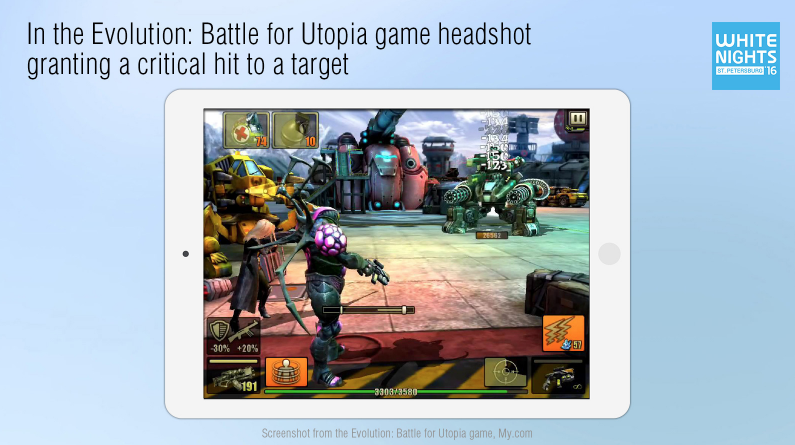
The next thing I would like to mention is Fitts’s law (Paul Morris Fitts (1912-1965), an American psychologist who worked at the University of Rochester on subjects including the experimental psychology).
The Fitts’s law states that the time required to position on a certain element is the function of distance to this element and its size. This means that the closer and bigger you make the target, the faster the user will process it.
For example, in Evolution this law has a rather clear gaming purpose. Here, there is a special aiming mode, where a player causes critical damage to an enemy by hitting a tiny head of the opponent, crashing through the armor and awarding himself with the enemy’s blood fountain (i.e. the player is awarded for aiming and hitting a less visible object).
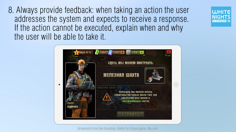
8. Provide the feedback to the user
The interface should always give feedback to the user. If a user accesses it, it means he expects an answer. By pushing a button, a player should have a clear understanding of what happened as a result. If an event failed to happen, he must know why and what to do next. If a button is locked and you do not tell why you keep the user guessing about it. Or you just make him click this button in a hope of getting a prompt. The worst thing is when he is not prompted at all. It appears as though an action cannot be taken and that’s it.
I often come across games that allow for absolutely empty windows. Areas that can potentially contain letters, items or something else are kept empty at the moment of access. In this case, it’s worth prompting the user on what’s going on by saying something like: “There is no new mail today”.
9.Use context help
The last thing I want to talk about is the context prompts (pop-ups). This is what a lazy user likes the most, after getting accustomed to comfort.
The idea to compare artifacts in RPG is as old as the hills. Everybody understands how important this function could be to an active user. Observing your players, you will be able to locate a hundred of spots where you could simplify the gameplay by prompts and pop-ups.
For example, here are Juggernaut Wars printscreens.
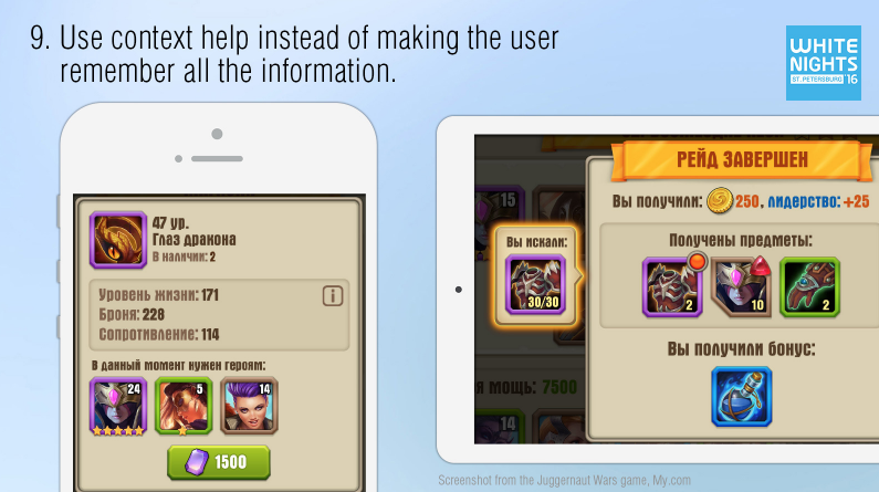
To the left, we have a painfully familiar thing – a list of artifact’s features. I came across a dozen of versions of such a list with words extremely hard to memorize like “Enlightenment”. What does that really mean and how does it affect the game? Moreover, when you have a couple of dozens of such characteristics, any novice player is in trouble. Many people even manage to abbreviate such attributes to fit them all in the list.
In this case, we wrote one short but clear-to-use prompt about game stats. You are able to use the prompt by pushing “i” right at the place, where the attributes are mentioned.
Another good example of prompting is a red indicator, which prompts that you need this specific thing right now. If you tap it, you will be prompted on who specifically needs this thing.
To the right, you can see a widget, which is meant to prompt you why you came to the battle ground and what resources you still need to collect.
This widget appeared thanks to the following story. Once I was observing our colleagues playing in the canteen. They were moving their lips and counting something aloud. As it turned out, they were counting the required resources that were falling down from time to time – and they had to keep the current number of them in mind.
BTW, the players really appreciated the introduction of such an elegant solution.
That’s all folks. But as you may guess, it’s just a top of the iceberg. There are tons of approaches to studying the user’s behavior and this number grows with each day. The more time you will be paying to the level of the product’s usability on all stages of design, the better would be the quality of the final product.