This article by Arnaldo Licea originally appeared on his blog on Oct 1
Arnaldo Licea, Lead Designer at Naughty Dog
The Setup
One of my favorite combat encounters to work on from The Last of Us Part II was the mall infiltration. Ellie has come to a point in her journey towards finding Abby in the aquarium where she can no longer travel on foot because of massive flooding. There is a sense of urgency in the narrative where it’s imperative to find a solution. She follows an enemy boat into the mall where she must infiltrate and commandeer it to be able to accomplish her goal.
The Location
The original high-level direction I got was to build a combat encounter that serves as a showcase from swim combat, a first for The Last of Us, the introduction of a playable motorized vehicle, also a first, and progressive complications for Ellie, especially in light of her and her companion splitting ways in this point of the story.
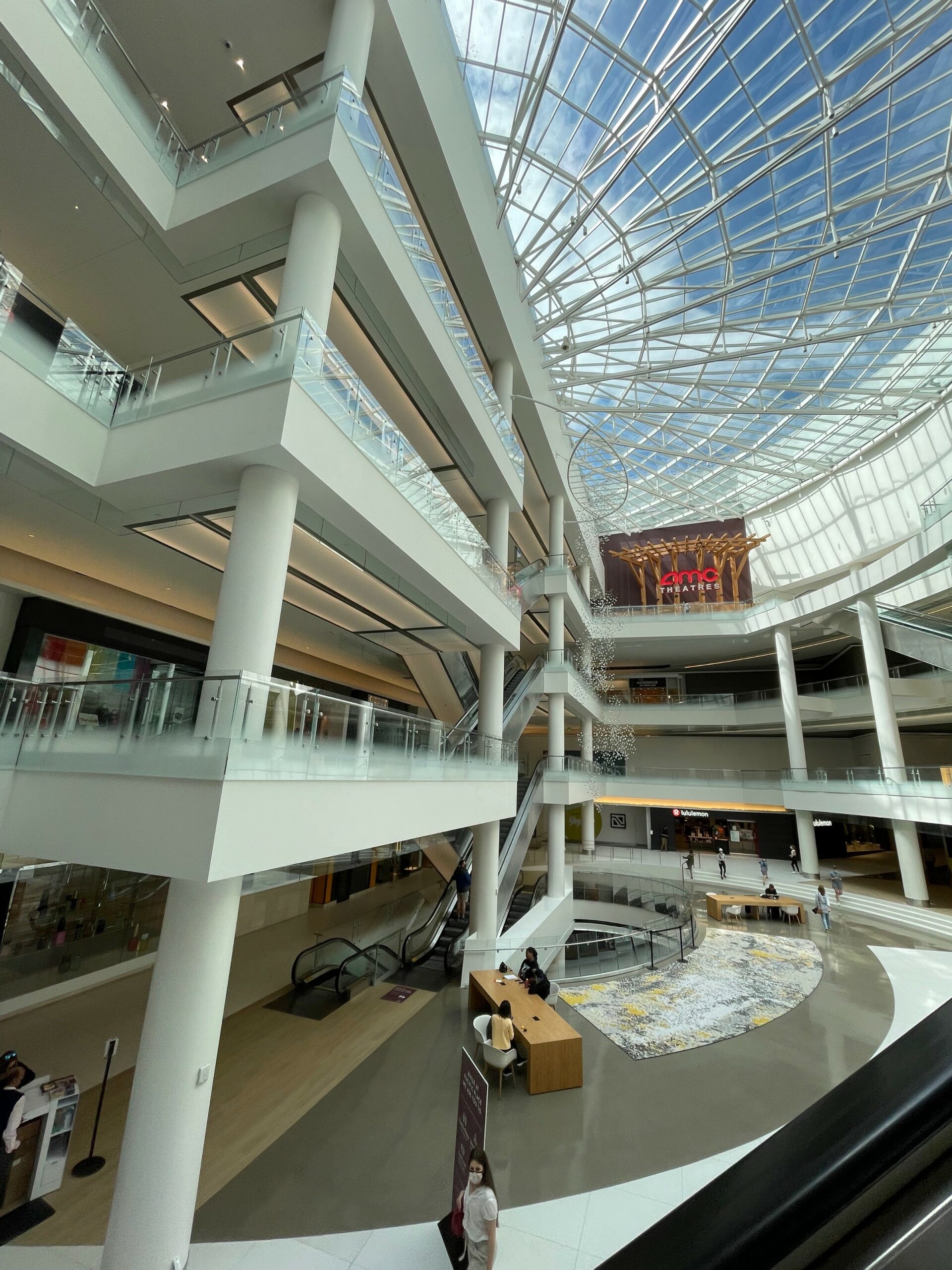
So, with that high-level direction in mind, how to start? In building the structure for how the whole chapter would play out, I began where pretty much every level designer on the project begins: looking at Google Maps. We knew for certain that we wanted to start the level from the theater, which we knew which one we wanted to reference, and wanted to end in the aquarium, also inspired by a real world location. So I started doing some location scouting on what areas could be good beats to hit. We always talked about going through the convention center but I also found some other areas that drew my attention, including the GameWorks arcade, the monorail area between the Westin hotel towers, and the mall.
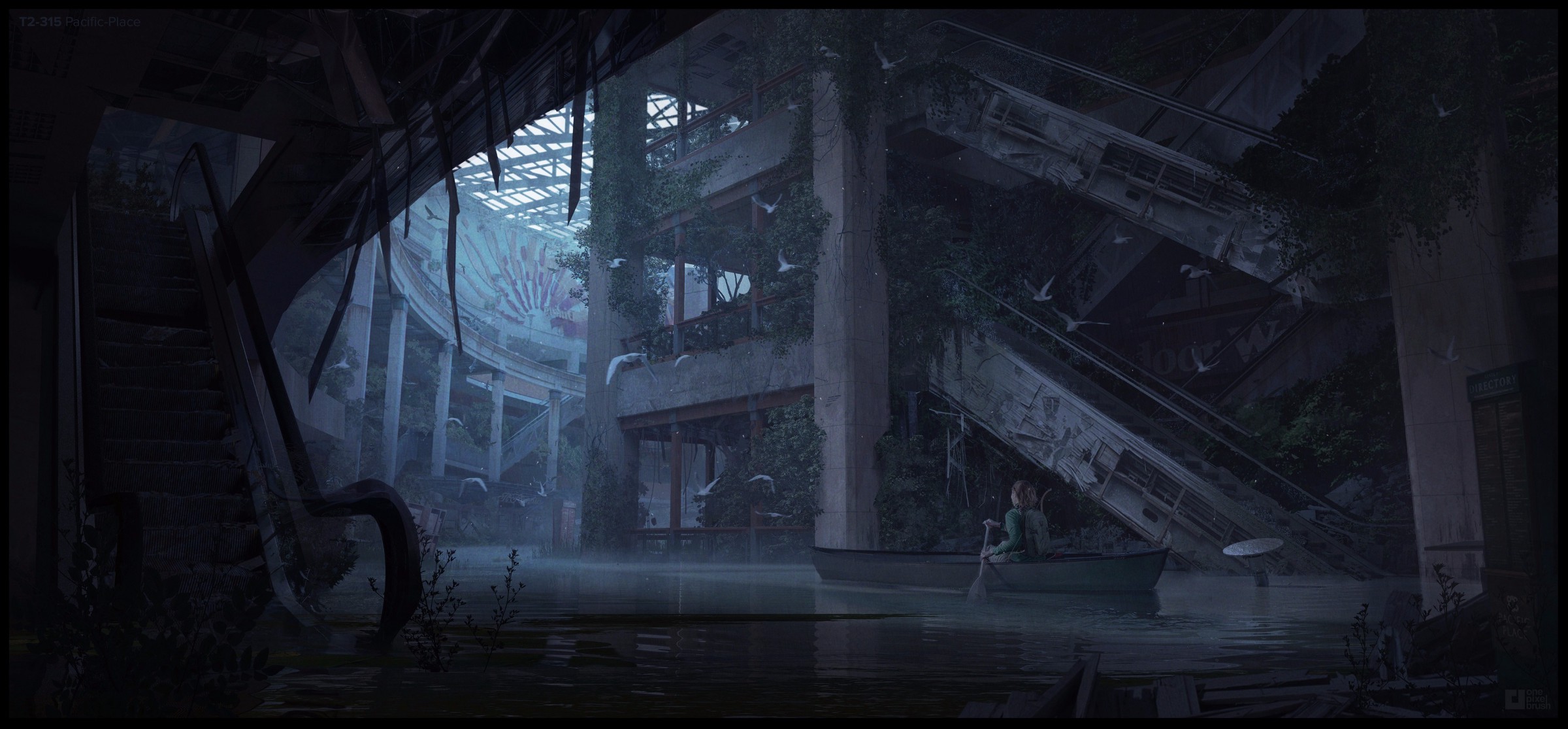
The mall was particularly inspiring because of a piece of blue sky concept art we had:
I loved the idea of taking the boat inside buildings that felt like caves so I was fully onboard to recreate the feeling from this concept art for a flooded Seattle mall but I wanted it to be a combat space instead of a mellow traversal layout. The grandness of the high ceilings and multi-level structure made it a perfect place for a seemingly insurmountable task.
Swim Combat In The Last of Us
So now that I have a location and goals in the level, it was time to start figuring out what swim combat was like for The Last of Us. We’ve done swim combat before in Uncharted 4 and Liz Fiacco had done some test layouts in pre-production but it was now time to put all of those learnings into a production level.
Player Mechanics
One of the biggest things to think about was how it would feel to swim as Ellie and how do we tune swim to work with combat that did not make it feel like Uncharted? Ellie is not Drake. In Uncharted 4, swimming was a good way to reset combat and get back into stealth. You could just jump in the water, swim to the other side of the level, and kind of wait for enemies to lose you. This felt fine in a fast-paced action game like Uncharted but The Last of Us is about improvisation and tension. Swimming is something that only the player can do but we wanted it to feel risky to use.
Throughout production we tweaked various things like how long can Ellie hold her breath, how fast she can swim, how much of the environment can you see underwater, if you drop from a high ledge that you remain underwater, etc. In Uncharted 4, Drake could shoot from the water but we definitely didn’t want to do that for Ellie. While we got a lot of push back from focus testers sometimes, we thought that this was a good way to communicate that Ellie is not an action hero like Drake. The balance was tough but, in the end, I feel we hit our goals of not making Ellie feel like a fish, having the tension that you can escape in water but still run a risk — you may run out of breath or emerge around enemies, but above all, a mechanic that is fun to play.
Layout Metrics
It was very important to establish good metrics for swimming. In combat, especially, you don’t want to run into ambiguous metrics that can cause frustration and potentially get you killed. You want things to be clear and readable so that you can spend your time planning out your next move or escaping from enemies. It was also really important to be consistent about the metrics. For example, all ledges you can climb from water are 0.25m above the surface and the platform wall always extends below the surface to indicate a potential climbing platform. Anything between 0.25m and 0.75m would be too ambigous for climbing.
For anything underwater, the metrics are more loose. They kept changing as we tweaked the breath meter. We wanted Ellie to start running out of breath before getting to the exits to encourage improvisation. Believe me, we tweaked this till basically the end. It required so much to come together, like underwater readability and more, in order to properly assess it.
Enemy AI
The other big question was how do enemies react to you in water? Can they hear your splashes? How do they path around a space that sometimes requires swimming to get across? This was a combined effort from the AI team, the combat designer, and layout. We knew for sure we didn’t want enemies to swim. We wanted them to react to the water because players expected them to but when we added a audio event that enemies could hear, the combat became exponentially more difficult. For this one, we had to just keep it simple and have them not hear the splashes but have them follow you to the water and try to shoot you, if you get spotted.
Matthew Gallant, the combat designer for the mall, made this bespoke system where enemies could try to predict which hole you were bound to come up from. For a time, it was extremely difficult to get anywhere! We tuned it down and found a balance because we also wanted to be able to see enemies from below the surface. Having them be near the edge allowed for this.
We also tweaked how deep in the water they can see you. So if you’re below 2 or 3m underwater, enemies will start losing you. We kind of cheated this by using an invisible plane with stealth grass properties on it. Our stealth grass already had features that decreased how much enemies could see you so we just used it for the water and it worked great! The deeper you swim, the harder it is for enemies to spot you.
In the end, we were able to make enemies feel unique because of the combat encounters unique mechanic while still leveraging our combat sandbox mechanics. It was a tricky balance to strike, for sure.
The Layout
Structure
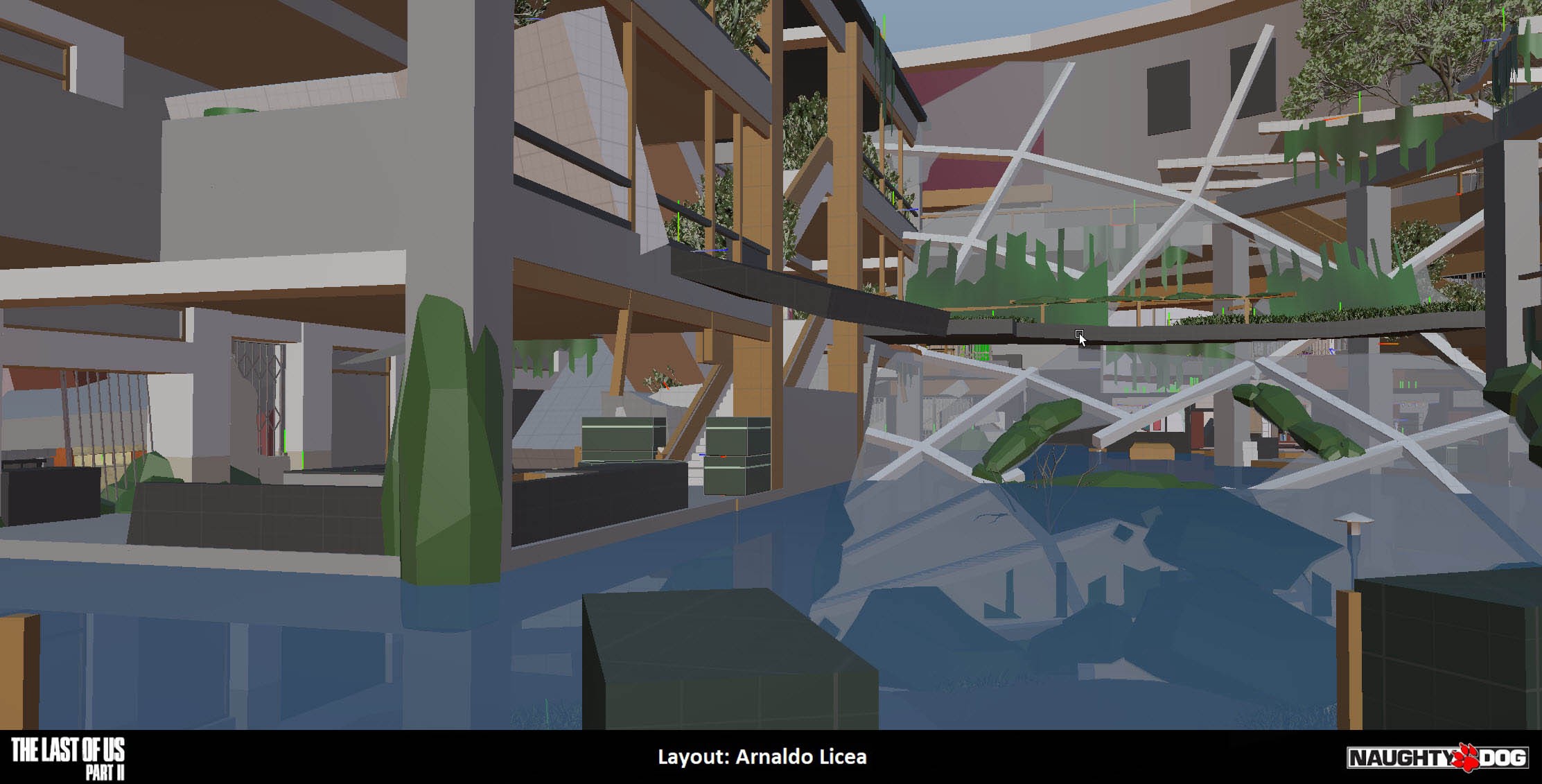
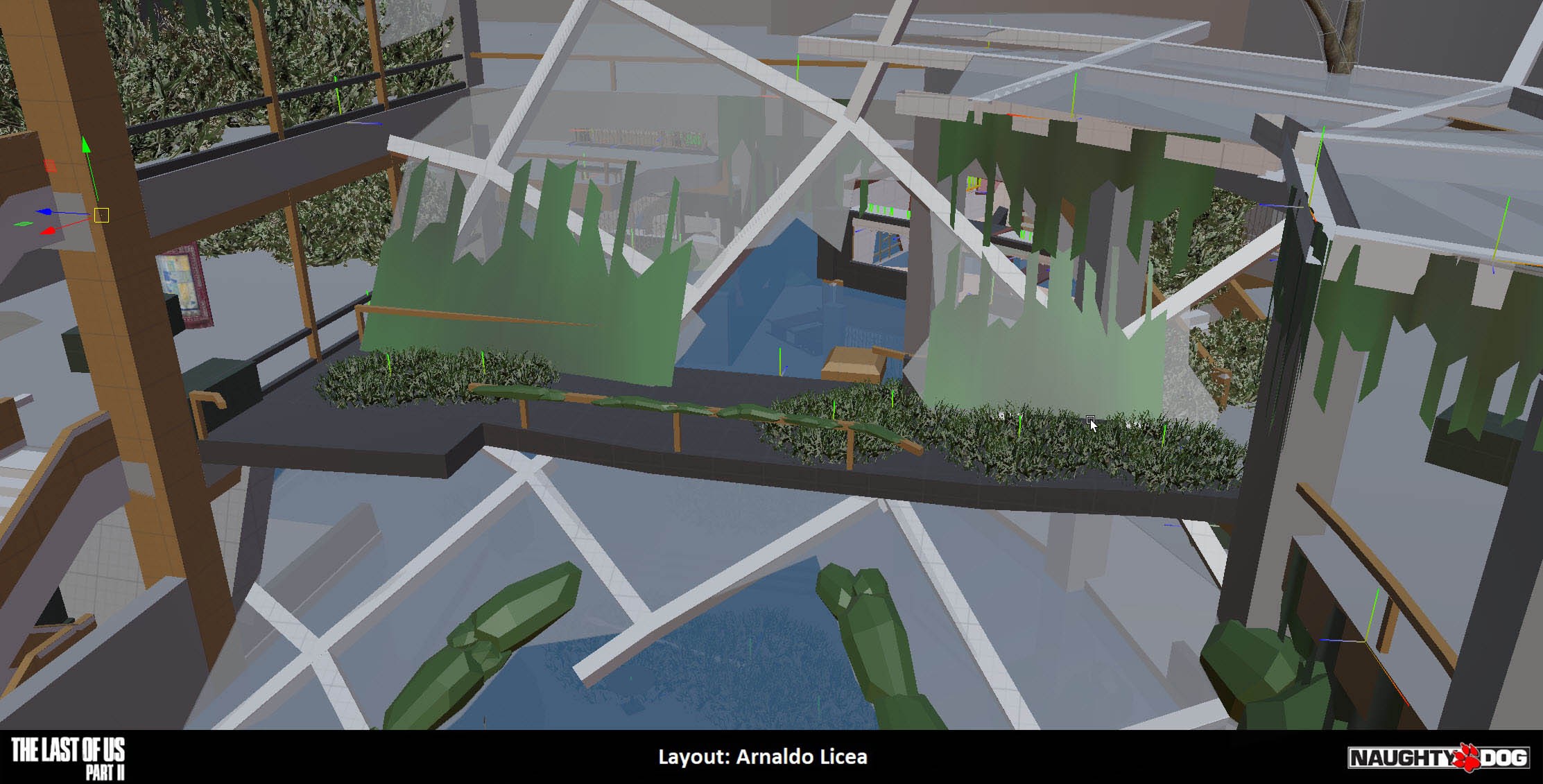
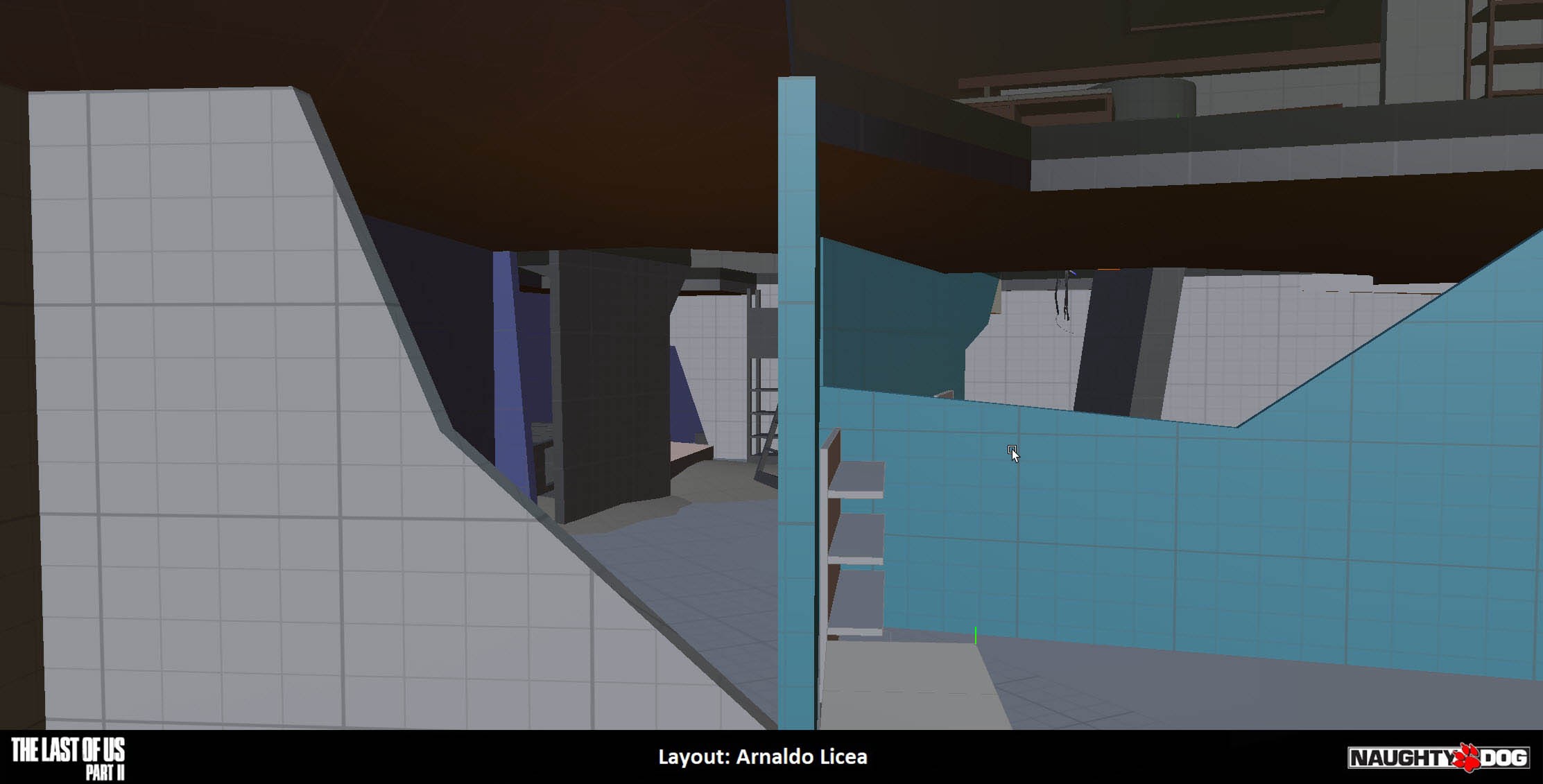
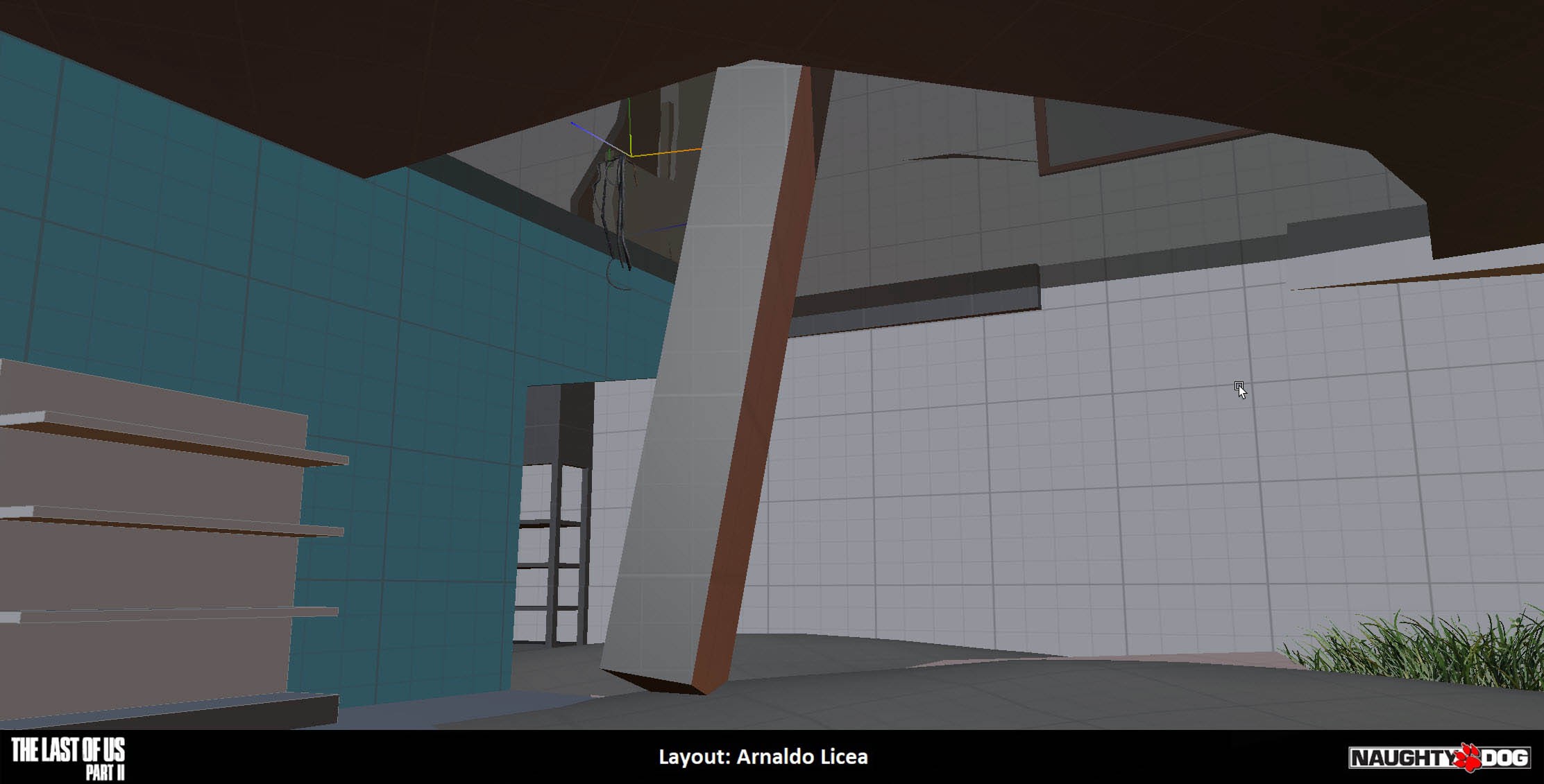
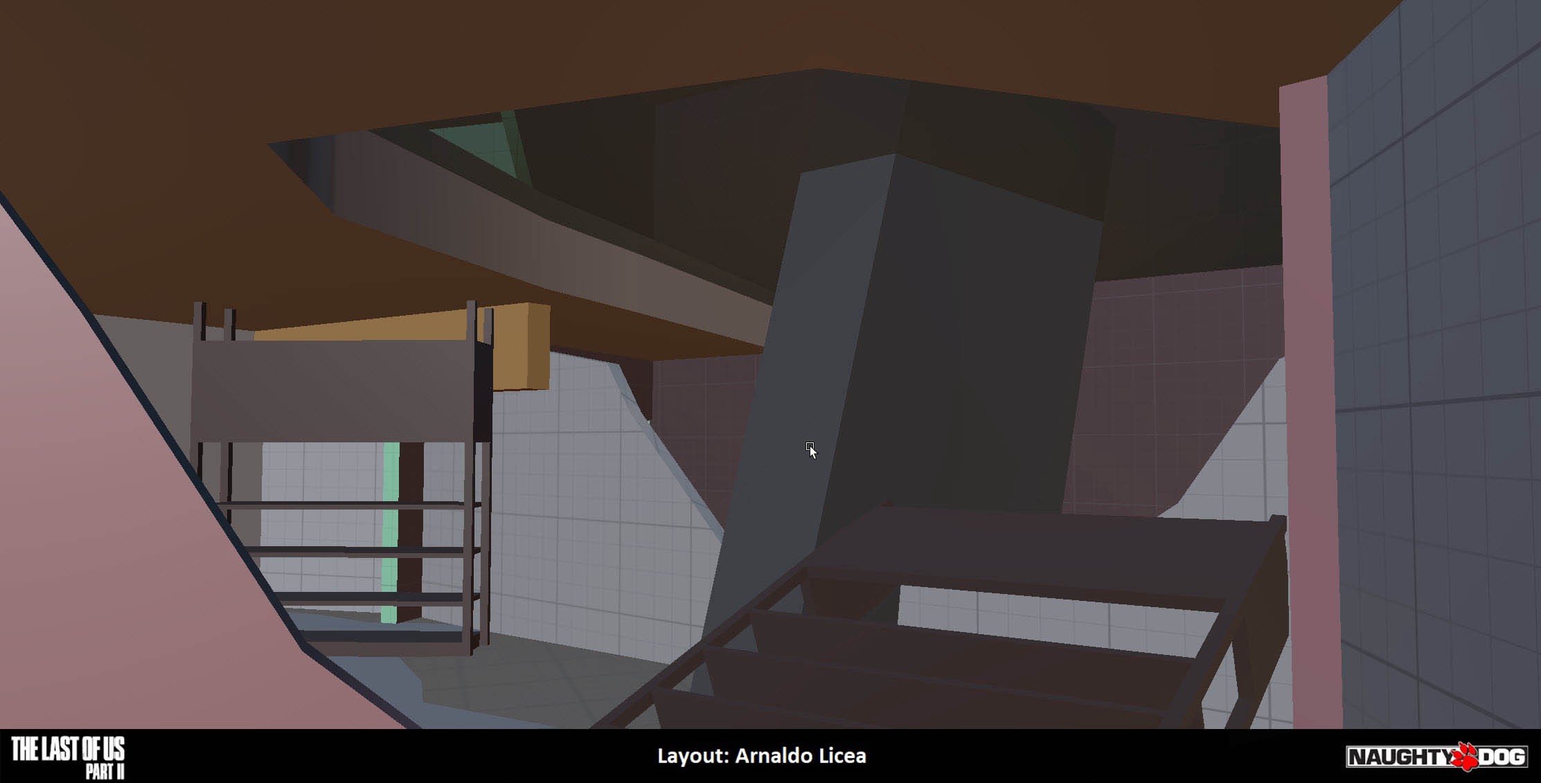
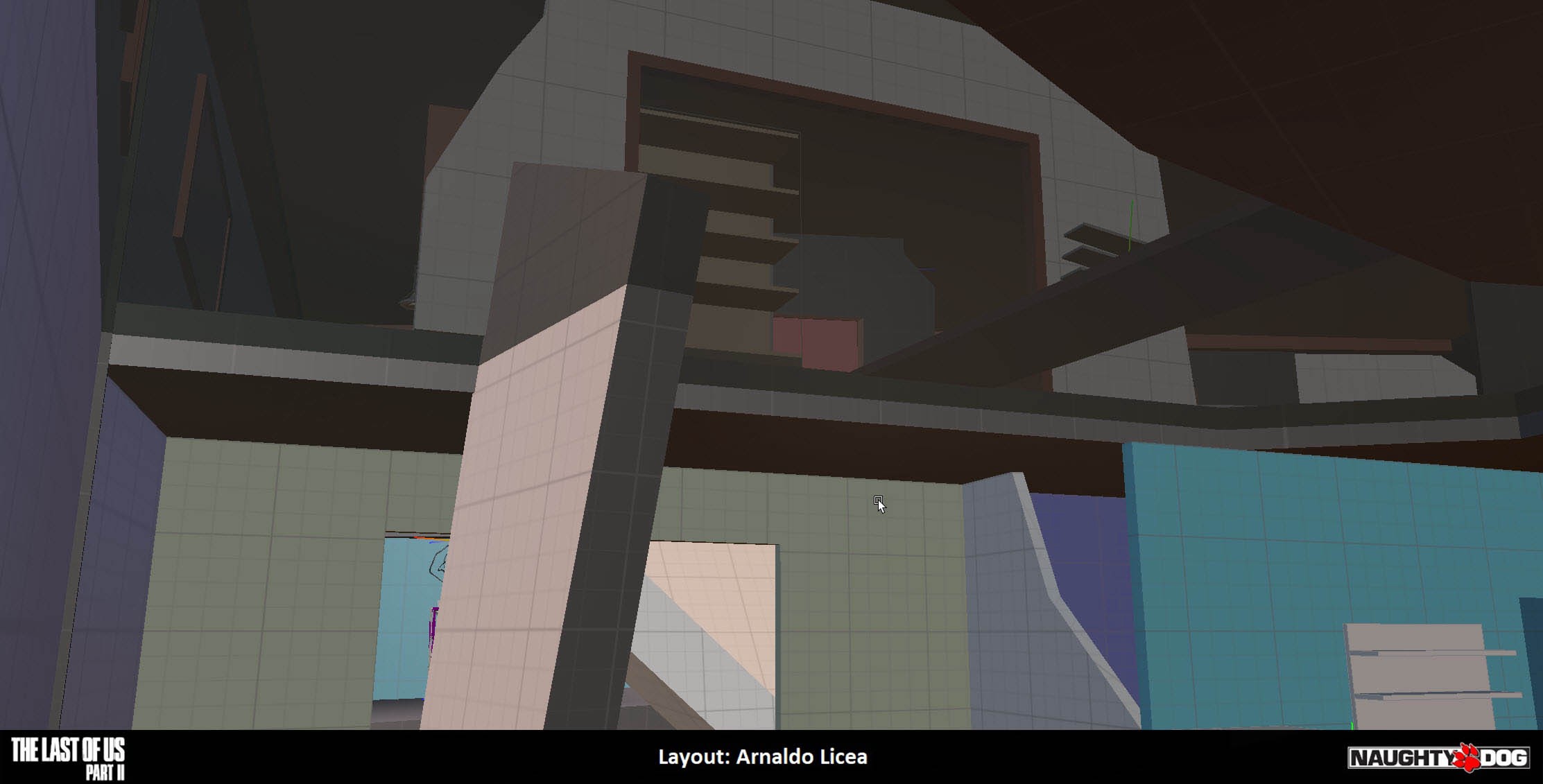
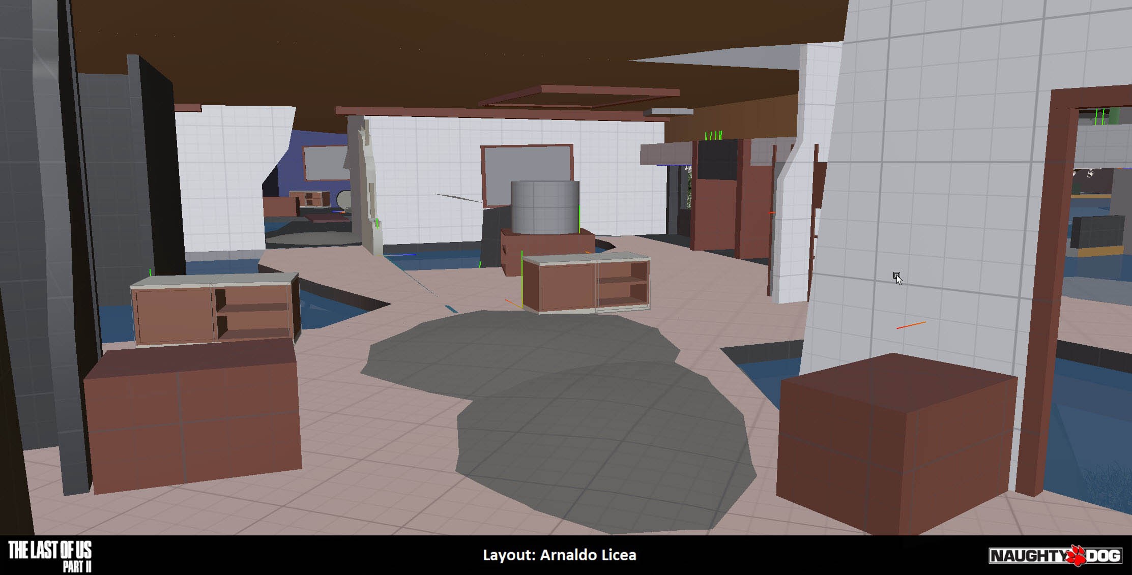
The Seattle mall is mostly a semi-circle structure. I kind of liked that because it already gave me an asymmetrical space to work with. I also liked that the center was big and open because it created a big no man’s land that I wanted players to be able to swim across when traversing from one end to the other. Originally, I used the sides as lanes, with some open stores, but it was more of a bowl. The boat was at the end but you could basically just swim up to it. You didn’t really feel like you were earning it and it didn’t accomplish the feeling we were looking with Ellie having to overcome huge odds against her. I always kid around that for The Last of Us level design: “When in doubt, break it down”. Meaning that we can use destruction as a way to get the shapes we need in gameplay. We strive to make our spaces feel authentic but not every space is ideal for the gameplay you want so I collapsed the ceiling of the mall to create this big physical barrier to the boat.
This afforded me several things. It partitioned the space in two, which presented a fork for the player to choose a lane to progress through, it created a path for enemies to cut you off above, so if you swim to the other lane and they can’t follow they can still be in front of you, and finally, it allowed me to position the player for a good view of the boat before entering the second half of the combat.
The first space also became a sandbox to get you used to swim combat and then the second half put the goal in focus and expands on that gameplay. It became an encounter of stages, which felt right for an infiltration.
Readability
How can you tell when there’s a water escape route above water and underwater? How readable is the underwater portion going to be, when we’re inside a building and it’s bound to be dark? There are the obvious areas, like the center that is full of water but there are holes inside the store that need to stand out. A big component of all of this is lighting and FX.
A lot of the solution for readability was clever use of lighting and fx that allowed us to make the water stand out with carefully placed lighting and caustic effects. We used this in several areas to subtly highlight the water exits. This all took several iterations to get right and not make it feel forced.
Shape Language
Another big aspect that needed solving was the shape language. Players have a hard time looking up and every exit from underwater is above you. We thought about creating pockets of air in the underwater bits but we would run into the same issue as before, where it would become a space to reset combat.
That means that the underwater routes had to be risky but also allow different paths in case enemies we posted in the exit and you could see them from above.
One element that helped out a lot where vertical shaped that went from the ground to above the surface. This signaled to players that they could exit the water through there.
The other cool thing about them is that the can serve as cover for both underwater and above the surface. If the player saw them, they knew they could safely emerge behind them with less of a risk of getting spotted by enemies.
Another thing to always keep in mind was to have cover nearby for the exits. Getting out of water is a slow action and you want to make sure that you decrease the chances of getting spotted by clambering next to cover.
The Boat and the Escape
The Goal
The boat, the first playable motorized vehicle in The Last of Us, is a whole blog post in itself but suffice to say was another challenge altogether with this layout. The goal of the whole encounter is to retrieve this boat to proceed to the aquarium through a flooded downtown Seattle. We knew we wanted this whole setup to be a sort of infiltration on this sort of rendezvous point for the WLF en route to Scar island for their invasion so we knew it would be a big fight.
One of the things we definitely wanted in the game, in terms of combat encounters, was the ability to stealth through them. It was your choice whether to engage with enemies or try to get through them without being spotted. That was definitely something I wanted to do in this space as well. I could imagine sneaking up to the boat and escaping with it — It feels so satisfying to accomplish. But not everything goes according to plan…
The Gap
For the entire level, and partially to highlight the struggle of getting through the flooded city, I wanted the boat to be like the Millennium Falcon. It’s old and is always breaking down. We give a big hint in the cinematic before the fight where we frame one of the WLF soldiers trying to fix it in the middle of a breakdown and even before that, we hear the soldiers talking about how unreliable the boat is.
So what happens when you get to the boat and try to turn it on? Yep! Progressive complications! The engine doesn’t start and you have to do a version of the generator mini game, which Bryan Collinsworth and I worked on, to get it going. The noise will alert any nearby enemies. In this case, if you can get it started fast enough, you can have a daring escape where you’re speeding out of the mall while being shot at. Matthew Gallant, our Lead Systems Designer, scripted their accuracy to decrease when you where near the exit so that you could experience this moment without the frustration of dying at the exit.
Yet another challenge was that the player had never driven the boat before so they, potentially, would be learning how to drive it under duress. In development, we had the alternate control scheme, that is more similar to the Uncharted 4 jeep controls, as the default scheme but found that a lot of people had trouble adjusting. Their first instinct was that it controlled like the horse, which was the TLOU paradigm of a playable vehicle. We opted to default to those controls and make the experience a bit more frictionless, in case you’re under duress. You can still change to the other controls in the options menu.
Conclusion
This was a super fun layout to work on. It was a big and ambitious layout that supported more than one unique mechanic that hadn’t been done in previous levels on top of leveraging the combat sandbox we had already established in previous levels. Every level in the game is touched by every department and it’s too many to list them all, but I want to give special shout outs to those people I worked most closely with on this one:
Kurt Margenau — Co-Game Director
Richard Cambier — Lead Designer
Matthew Gallant — Lead Systems Designer
Bryan Collinsworth — Designer
John Sweeney — Art Director
Andres Rodriguez — Lead Environment Artist
Andrew Watkins — Environment Artist
Joakim Stigsson — Environment Artist
Adam Littledale — Environment Artist
Elaine Kubik — FX Artist
Mark Shoaf — Lead Lighting Artist
Scott Greenway — Lighting Artist
Brittany Renz-Lopez — QA
Manolo Rosenberg — QA
Sandeep Shekar — Lead Programmer
Kan Xu — Programmer
Halley Gross — Narrative Lead
And everyone else at the studio that playtested and gave feedback or ideas for the space!
Reel of my work on The Last of Us Part II
This article by Arnaldo Licea originally appeared on his blog on Oct 1


