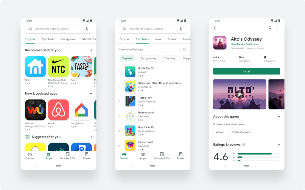
The Google Play Store has received a new design. It makes it easier to find games and apps.

All the changes in how the store looks are detailed in Android Developers Blog.
List of changes:
- a new navigation bar at the bottom of the store on mobile (on tablets and Chrome it is on the left);

- the updated page layout contains more information about the selected game, and the install button has become more visible;

- A new form of icons that helps games stand out against the interface.

Android game developers are encouraged to update the old icons to take advantage of the new features. To make a compelling Google Play store listing, we suggest that you use this guide.
