Egor Karpov, Mobile Marketing Consultant, told us how banner experiments helped him significantly reduce CPI of the Emojination game.
The game is more than 4 years and it brought more than $1M to its developers.
There is no user support or updates but the game is still earning money. So developers continue to spend a little on traffic and optimization.
The problem is that the traffic in many countries wasn’t profitable enough and the developers burnt their fingers buying it. It seemed impossible to push the project further.
We experimented a lot with the banners and found out that the best option was depicting actual puzzles from the game with the text that challenges the player, like “Can you solve it?” and “Check how smart you are!”
Previously, we used similar banners, but with plenty of words and objects depicted on them.
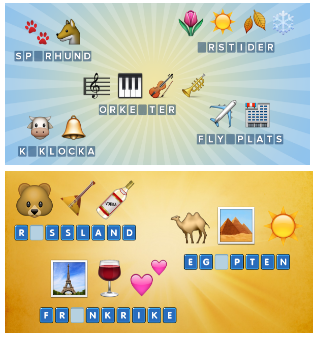
At the beginning, we had CTR around 0.7% – 1.5%. CPI wasn’t low enough. It was good according to the market standards but not for us.
By the way, the conversion of the store page into installs always was between 60% and 95% depending on the country and the audience. And as we noticed it had nothing to do with the banners: people immediately understood what kind of game this was. Nothing changed when they visited store page
New banners showed some good results.
CTR was about 2.2 % , and sometimes with the new audience around 4% – 5%.
The users were sure to be tired seeing the same banners and it affected CTR.
Another reason for the CTR fall was that lookalike audience dropped short quickly (around 1-2 months in each country) .
We regularly rebuild all our advertising materials, created new lookalike audiences, tried old banners to get close to our old results, but each iteration was getting worse and worse.
And three years later, when Emojination earned its first million of dollars, we didn’t even hope to achieve that traffic flow as we had before.
Then we released Emojination 2 and decided to make new banners so that users knew we had a new game.
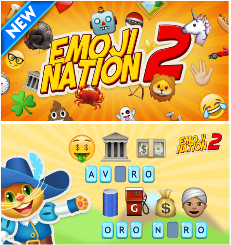
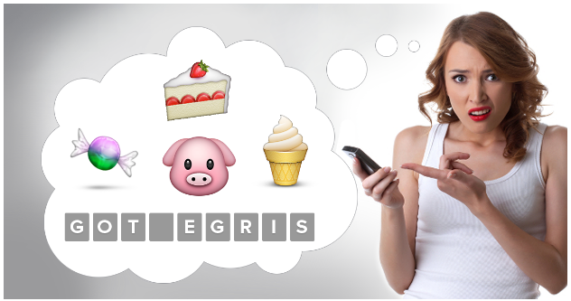
It came out well, but not as good as we wanted. And then accidentally we had an idea to make banners that look like a screenshot of a chat with emoji.
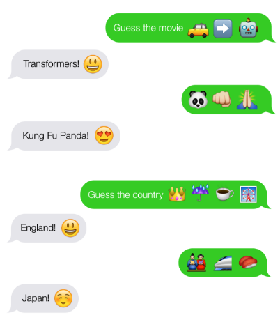
This approach was well received. The average CPI dropped to 5 rubles (around $0,08).
Not to miss the opportunity we took the same banners and started running them for the first part of the game. We got the best result of all time. And that’s 3 years after the release! At first, we tried not to cross audiences, but then we let it loose – it was still going well.
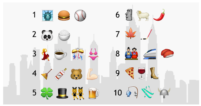
Other banners were well received too: a list of countries, films and so on with the “Guess all 10” text.
Regarding the texts.
Facebook still allows CAPS. So the text can be very catchy, something like “OMG! This game is ABSOLUTELY awesome!”
And using emoji in texts also helps.
We came to the conclusion, that showing real gameplay is the right way, even if it’s just a screenshot. Page conversion doesn’t decrease, and CTR is usually higher. And the simpler screenshots – the better.
But there is one thing about simplicity: if you find your audience, you get comfortable CPI anyway. In order to jump over your head, you need to apply a creative approach. Try to draw attention with something unusual, but at the same time relevant. In our case, it was a fictional chat of two friends using emoji.
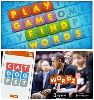
Our ideas were confirmed when we experimented with the other game’s banners.
Before:
After:
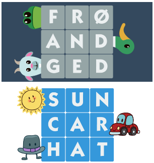
As a result, CTR was doubled and it solved all the problems.
The conclusion here is not to go far from reality drawing beautiful and absolutely irrelevant banners. It doesn’t work. Make them as close as possible to the point of the game, but at the same time creative and catchy.
