A banner is the facade of your company; comprehensive image designed to present your app to the public and make them think they want it. We have seen and dealt with hundreds of banners, so we came up a set of approaches to this intricate craft.
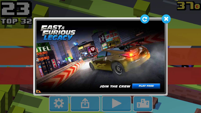
Image Credit: Crossy Road
GENERAL POINTS
1. Lies from the start are bad for everyone
One of the most popular mobile game genres today is a city builder with combat (where players can attack each other’s cities, like in Game of War, Clash of Kings, Kingdoms of Camelot etc.). Such titles have one major disadvantage: they attract new players poorly. It is explained by tough competition on the market, as well as high entry requirements. Last but not least, games of this type have average graphics, and by average we mean mediocre: it is the same boring cityscape, recurring from one game to another, and a dozen of various menus.
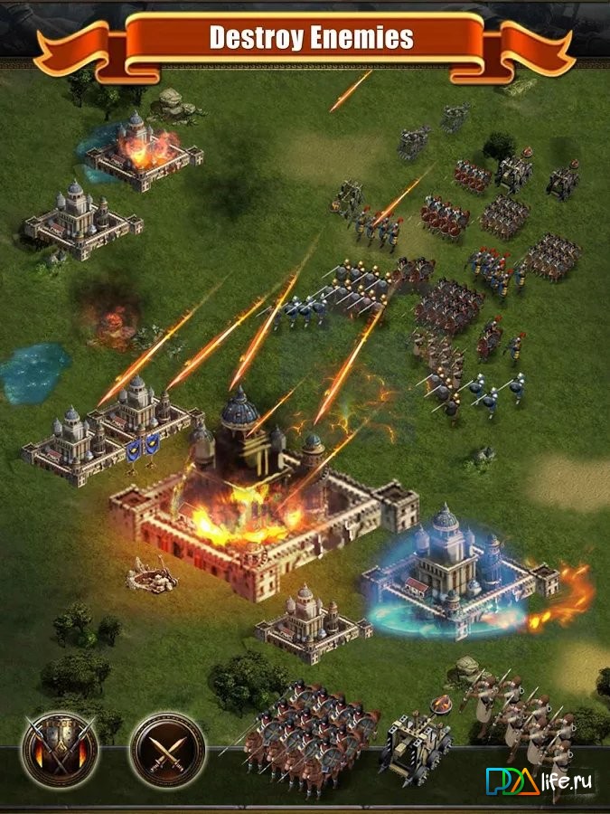
Clash of King screenshot
Thus, even banners with real screenshots get repetitive, and people at some point stop paying any attention to them. This is when many advertisers resort to cheating: they start posting screenshots of entirely different games that are similar to the promoted product only in a premise.
For example, games set in Medieval (or Medieval-like epoch) are advertised by images taken from such legendary titles like Heroes of Might and Magic III, The Elder Scrolls V: Skyrim and Age of Empires II: The Age of Kings. Many gamers would love to see these on their gadgets, so they click on these banners in high hopes… that, of course, will never be fulfilled.
Some projects do profit from such tricks, but on the whole, the mobile advertising market suffers. Potential players get not just irritated but utterly disgusted by banners, as they understand that majority of them are lies. As a result, game developers terminate contracts with unreliable advertising agencies that have brought to them low-grade traffic.
We recommend you to never use that approach to player attraction: those banners will simply not do this.
2. A good advertising campaign is the result of joint efforts of a designer and media buying manager
As good as a banner may be, it will not work if targeting fails. This happens when a designer has created an ad with a certain message, but a media buying manager has presented it in another way or to the wrong audience.
To avoid such situations, you have to always clarify your idea for the contractor. You can do it in discussion or on paper, but it would be better if you came up with the text to be displayed on the banner in advance so that the designer could integrate it into his work.
If the contractor is given the task to create a banner at his will, he will have to explain his idea to the media buying manager, so that the latter could comprise a proper text, i.e. not conflicting with the image, and set a campaign in motion.
Imagine that you are planning to promote, say, slots in the USA and Russia. The media buyer knows that that kind of genre appeals to different audiences in these very different countries. So, he will tell the artist to draw two distinct sets of banners. The first one, for Americans, will feature grannies and kitties, while the second one – taxi drivers and golden chains.

Slots ads in the USA…
…and in Russia
And now imagine this: the manager and designer had not contacted at all. Given that, the latter would have simply drawn a shining beauty in front of slots, which would kill the advertising campaign.
3. The result of successful advertising is the constant inflow of new active app users
Any mobile game developer expects to see two things grow after the end of the advertising campaign: number of players and revenue. Of course, if the project is outright bad, none of this will happen, but generally, it is a common expectation.
In other words, only good games are set in motion by advertising campaigns. If there are bugs in the code, entry requirements are too high, the tutorial is a mess, and controls and UI are “painful”, there will be no motion, let alone return on investment, no matter how much the developer had spent on advertising.
4. Bright and perplexing banner are more frequently clicked on, but you have to be careful
Did you know that TV ads are aired at a higher volume than programs and movies? The same with mobile games’ banners: they are often made perplexing and shining. It is believed that people are attracted by such images, but it is only partly true, as max brightness only works in certain cases.
The colors of the image set the mood and evokes associations. For example, the prevalence of red in the banner is often a sign that the game is dynamic and brutal, so it is better not to use red in an advertising campaign for a title with quiet, contemplative gameplay.
Colors and their brightness do strike one’s eye, but attention to the banner depends more on surrounding posts in the newsfeed. So, an ad with a white background can be as noticeable as a glaring board.
5. Concept is the core of the banner’s efficiency, not quality
The practice has shown that clearly cut images, thought-out color palette, fancy buttons and other cosmetic things are, of course, important for the banner, but the concept is truly paramount.
Readability is the necessary feature of a good banner, but in fact, human brain can derive information even from images like this one:

So, whether or not to do the make-up depends on how much time production of the banner must take. Know that a simple ad can be distinguishable in the midst of bright creative ones.
6. The idea of the banner should be clear for viewers
Sometimes images in advertising just refuse to ring anyone’s bells. For example, if a perfumery store posts a banner with a photo with only a woman in it, no one will guess that it is trying to sell perfume until they read a description. Even if the purpose of the photo is to draw attention to the text, people will more likely skip the whole ad rather than read those 90 symbols.
A very straightforward ad
The best decision for advertising non-game mobile apps is the direct approach: instead of playing with the abstract concepts of ‘beauty’ and ‘fragrance’, just post a photo of a flask of perfume and accompany it with a call to action, like: “Order perfumery with a discount through this application”.
The same concerns game apps. Lack of gameplay in banners leads to questions rather than actions.
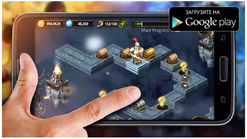
7. Images of mobile devices are perceived positively by viewers
The demonstration of the mobile device adds to the efficiency of the banner. The image of a smartphone or pad relays a message that the application will be really useful and frequently used, not just installed for the sake of statistics of some website or social group.
Of course, the display of the gadget should contain the screenshot of the application. The viewer will literally see himself holding it in his hands, ready to push buttons… and will more likely want to implement that image in reality.
A photograph of a hand holding a gadget allows viewers to better evaluate the size of the elements of the screenshot. Besides, it highlights that the app is managed by touch. You can also take a photo of a gadget and artificially add a photo or image of a hand with an index finger pointing at or touching some part of the display.
It is implied that photos should feature not random but certain gadgets for which the application is advertised. Different brands require different photos. Banners with applications for iOS should demonstrate the latest model of iPhone or iPad; the color of the gadget should contrast with that of the background (note: the Apple symbol on the device must not be visible, else the company will reject that application).
As for Android, use photos of the flagship models running on this OS. If you don’t mean to advertise the device’s manufacturer, you should blur the logo.
To demonstrate a vertical screenshot on a smartphone, it is not necessary to take a photo of the actual device. Sometimes it is more convenient to imitate the frame of the smartphone, i.e. impose a black or white rectangular and darken its edges to create an impression of volume. To make it look even more real, you can add some sort of a dynamic and a speck of light.
The banner with the telephone can also be a professional photograph. Advantages of this approach are plentiful: such banners are quite interesting, they demonstrate the natural look of mobile devices, and designers have to spend less time in graphics editors. However, it will require a high profile photographer (or at least camera), appropriate background and attributes. Moreover, display colors are usually distorted in photographs.
Perhaps, the photoshoot is not the most resource efficient way of making a banner, but it certainly is the most creative. Say, for a game set in Medieval, a banner could be a photo of a hand with ancient rings on fingers, holding a gadget in a castle hall. Or, a fellow traveler tracking app can be advertised by a photo of a friendly company in a car. It can even be real – your friends, your car.
Banner based on the photo of the mobile device
If we are talking advertising to pad owners, there should certainly be made a distinct set of banners devoted to specific devices. There are fewer tablet users than smartphone users but, at the same time, the former are wealthier: they are ready to spend more on devices with a large display especially for gaming.
8. Reflect the prevalent gender of your target audience in the banner.
To promote an app designed for women, it is recommended to use a photo of a female hand. Women seldom get irritated at banners like these because they perceive them as personal offers.

POPULAR BANNER TEMPLATES
9. Screenshots from store: resources at your fingertips
What if only images from Internet stores were allowed for using in advertising? Well, the only way to make them unique is to insert a text that will best correspond with the graphic content. Every screenshot has its strong sides, you just have to see them in promo versions and highlight them with a nice short piece of text.
The buildings on the screenshot below had been noted by a designer as having a beautiful artistic style to them, and that was pointed out in the text. The result exceeded expectations by far: the feeling of comfort evoked by the combination of the screenshot and text made the monotonous city building gameplay look attractive. The banner magic worked.
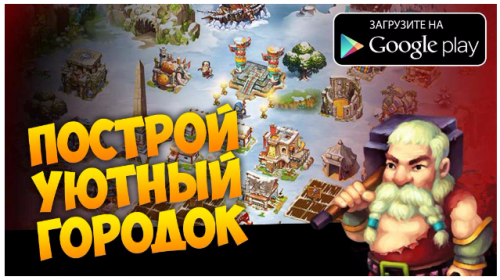
The text reads, “Build a beautiful town”
10. Beautified screenshots can save the day
The look of a screenshot can be enhanced by decorative elements or even “augmented”.
The functions of such alterations are to demonstrate what a player can do in a game and/or put a light gloss on gameplay. If interested users follow the link to the store and see that the screenshots are almost the same, save for little make-up, they will likely install the app.
“Augmenting” may imply framing, substitution of the background by another color or texture, erasing redundant elements or altering their size. There is nothing wrong in clearing the screenshot up.
11. Promise them character customization
Gamers love choosing the looks and equipment of their characters. This is why banners depicting hero customization screen have become so popular in advertising on the mobile games market.
Such ads are quite efficient because they show the variety of game elements, which gives players an opportunity to express themselves through their characters. However, as of late, players’ trust to banners of that kind has decreased, as many games that promise customization to win audience actually have no such feature.
If your project does have customization, it should be on the banner. Of course, the screenshot with the character and inventory has to be “augmented”, because many elements of it are either too small or redundant. Usually, customization screenshots for banners are “comprised” of parts of different screenshots.
12. Show how the character’s look changes with progress
This piece of advice concerns those mobile games that feature the single main character whose level not just grows but also directly affects the story and/or gameplay.
Such banners attract many users, and this is why: firstly, they show that the game has leveling; secondly, they promise to give players a cool hero to control; thirdly, gamers like it when character progression affects both strength and look. Developers, in their turn, like to economize on the latter.
13. If your game is based on a movie, you can use that film’s posters and frames
It is a lot easier to promote mobile apps based on an upcoming movie because people have already seen promos and trailers, so they can impose their expectations on the namesake title.
Moreover, a designer can combine in-game screenshots with movie posters and frames to make a recognizable banner, provided the advertiser has not banned their use.
ELEMENTS OF BANNERS
14. The important elements of the banner should be large
The displays of mobile devices (particularly smartphones) are usually too small to place them on the banner in their natural size, so screenshots have to be significantly extended. The text should also be clearly visible. Visually impaired users will be especially grateful and gladly follow the link in the ad.
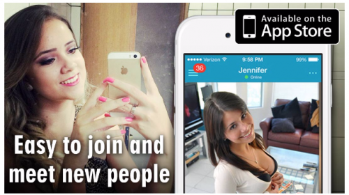
Banners for dating apps usually feature a simple photo of a random stranger; elements of the interface are almost absent
For horizontally oriented mobile games, it may be more efficient to use banner-wide screenshots instead of photographs of devices. It is done faster and allows to show a screenshot or art in more detail.
15. The word “Free” is not always useful
It would seem that the magic word “free” is a perfect addition to any banner for such an application. Why not give a try to something you don’t have to buy?
At the same time, users are quite good at defining the business model of the app before clicking on the banner – just by looking at it. So, if the word “free” doesn’t fit in the banner or messes it up, it had better be omitted or put in the description.
Any free app needs as many paying users as possible, but still, at any time, there will be much more stingy ones. Some apps even profit from them: they are source of fun in mobile MMO games for those who purchase overpowered gear, and source of income for developers of single-player games that advertise other applications
Lastly, there are applications that need from you only one thing – money. If you have it, you are a potential user, but if you don’t – you are useless. For example, consider online streaming services: their owners gain from monthly subscriptions that cost more than several pay-to-play mobile games combined. Advertising such apps to freebie enthusiasts is a road to bad traffic and, in the end, financial disaster. In this case, the word “free” had better not be on the banner.
16. Having a store’s icon is good but not a must
The “download for free” button can be substituted with an icon of the store – on condition that it has the word “download” in it. This will reduce the time expenses on the banner, while the banner itself will have fewer vacant spaces.
Placing the icon on the banner is akin to placing the gadget: they convey the same message that a mobile app is advertised, and the link leads to the referred store.
Remember that presence of badges, such as Google Play, App Store, and others, is the unwritten rule of banner making, so when viewers don’t see them, they may feel that something is wrong and choose to skip that ad. At the same time, if the icon brings disbalance to the composition of the banner or spoils the background, it can be spared.
17. Use to your advantage ratings and comments of users from the store page of the application
The banner can be made more attractive by displaying positive feedback from users and an average rating of the application. Do not forget to attach a screenshot of the source of information – you will need that to successfully pass moderation.
CONCLUDING THOUGHTS
18. Test different versions of one banner
Although there are certain standards for banners that designers tend to follow, the audience’s reaction can’t be precisely predicted. This is why banners are usually tested on the small scale before the launch of the advertising campaign at full throttle.
Testing will be more efficient with several versions of one banner. They could differ in a text, background or button color, type or model of gadget etc. The testing will provide useful statistics and help choose the most appropriate banner.
19. Details matter
So, now you know that only testing can tell you how elements of your banner affect the mood of potential users of your app. It doesn’t mean, however, that different versions of the banner can be comprised of random elements that may or may not attract the audience.
An example below shows the difference between the lazy and thought-out banner for a slot application. The former features a usual screenshot inside the display of the smartphone. The latter features a screenshot from the same game… with a winning combination. The first banner was unprofitable, while the second one was a pure success.

20. Make sure the banner looks good on the display of the mobile device
Some elements of your banner may look decent on one platform or be completely unreadable on another. So, another round of testing is necessary – this time not for different versions but different mobile devices.
To make this process run automatically the progress of work on the banners should be saved in folders that synchronize with the cloud. Then install the cloud service from the same provider on your mobile device, and the new banner will become available to watch on a smartphone or tab almost instantaneously.
If you have no such opportunity, you can just reduce the size of the image in the graphics editor to that of the display of the gadget. However, this method has one major disadvantage: it conceals pixels that will be visible on the smartphone display. So, this is very approximate to how the banner really looks on a small screen.